Front Porch Brewing hired me to design two of their beer labels. I was given creative freedom on both designs so I created a background story for each label to connect with the name, the type of beer, and its ingredients in order to create the custom designs.
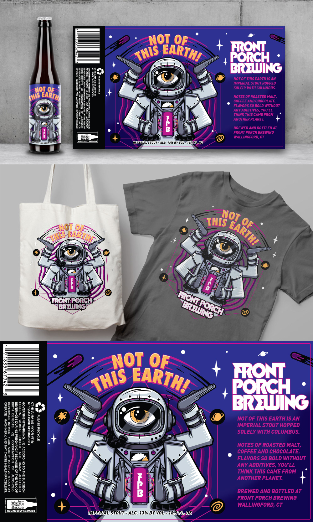
NOT OF THIS EARTH!
The background story is that the ingredients are literally flowing through the body parts of this creature. I was able to use metallic print, so I decided to have the grey areas (top of the can and the Front Porch Brewing logo) be the metallic can color so it looks like the design is merged with the can.
The beer is an Imperial Sour, so it has a bit of a twist to it with its fruity flavors of peaches and plumbs. So the body parts are not exactly human, they have a bit of a twist. I also wanted to highlight the ingredients so each arm has tattoos of the different fruits with nail polish to match.
The overall colors I wanted to look juicy and so good you'll want to taste it.
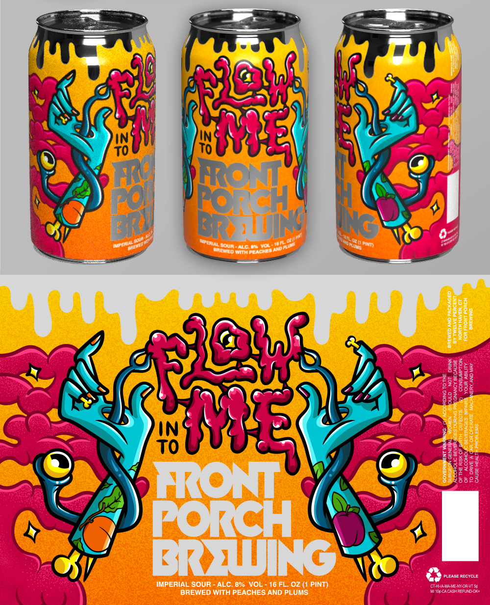
FLOW INTO ME
The background story is that the ingredients are literally flowing through the body parts of this creature. I was able to use metallic print, so I decided to have the grey areas (top of the can and the Front Porch Brewing logo) be the metallic can color so it looks like the design is merged with the can.
The beer is an Imperial Sour, so it has a bit of a twist to it with its fruity flavors of peaches and plumbs. So the body parts are not exactly human, they have a bit of a twist. I also wanted to highlight the ingredients so each arm has tattoos of the different fruits with nail polish to match.
The overall colors I wanted to look juicy and so good you'll want to taste it.